Writing Better Alt Text
Main Takeaways
- Alt text is a stand-in for images to make electronic documents more accessible.
- Not providing alt text excludes people that cannot see the image.
- Alt text should be concise, fit with the surrounding content, and avoid adding too much repetition to the information of a page.
- All images in web pages should have an “alt” attribute indicating their alt text.
- Images that truly contribute no distinct information to a web page should have “empty” alt text, or otherwise be marked as “decorative” in the document’s authoring tools.
Alternative Text (Alt text)
Alternative text, or alt text, is textual information provided to people using assistive technology as a substitute for visual elements in electronic documents. For example, someone who is Blind or Partially Sighted can use screen reading software to hear descriptions of images on a web page. Alt text ensures that they have equal access to the information that the images are providing to people who can see them. These descriptions help make documents more accessible and are provided by the authors or editors.
Accessibility for electronic documents is a legal requirement. Many people that have learned about accessibility for the web know how important alt text is, but writing useful alt text is a more nuanced topic in accessibility. Alt text is important in all electronic documents, not just web pages.
Computer programs like WAVE are great for catching cases of missing alt text, but deciding what information should be provided to describe each visual element requires human empathy and insight — two things programs like WAVE can’t provide.
This guide explores what to consider when writing alt text. Good alt text should also follow general web writing techniques. Please check out the NC State University Libraries’ other Targeted Accessibility Guides (TAGs) for recommendations on more ways to find and remediate accessibility barriers.
When To Write Alt Text
Virtually every image on the web and in electronic documents should have meaningful alt text associated with it. Without alt text, the presence of an image is announced to people using assistive technology, but the contents of the image remain a mystery. Information and context provided by the image is only available to sighted people.
Alt text for images is one of many text alternatives. There are a variety of other text alternatives for web content, such as video captions, and they all help remove accessibility barriers.
Getting Started
Writing alt text takes practice, but taking the time to provide it improves the quality of electronic documents. Whether you’re adding an image to an article, a Google Doc, or a social media post, alt text is always worth the effort. A good way to get into the habit of remembering to also provide alt text is to take a moment when adding any visual element to a page to consider:
- What information does it add?
- Do you know how to assign alt text in this case?
How to Write Good Alt Text
Every image tag in an HTML page should include an “alt” attribute, most frequently this should be a short stand-in for the image.

One possible alt text for this image could be:
“students in a theater”
Better alt text that provides a bit more context could be:
“Lab with full audience viewing student research on a curved screen”
Example of what HTML with alt text for this image looks like:
<img src="https://www.lib.ncsu.edu/media/thumbnails/f5a218.jpeg"
alt="Lab with full audience viewing student research on a curved screen" />
Many CMS (content management systems) and WYSIWYG (what you see is what you get, pronounced “wizzi wig”) web page editors will provide a place to enter alt text in the image’s “properties”. If you are not prompted to enter alt text after adding an image to a page, you should look for a way to add it.
Virtually all authoring tools for different types of electronic documents provide a way to assign alt text to an image because it is a legal requirement.
What To Include
Good alt text describes what is in the image, focusing on what is most relevant to the reason for including the image and has the following properties:
- it is as concise as reasonably possible
- it relates to the surrounding content of the page without being repetitive
- it avoids relying only on “sensory characteristics” to convey meaning
- its writing style is consistent with the writing style of the page
To that first point, while it is usually better to be concise, when images include text as part of the picture, it is critical to include all of the relevant text within the image in the alt text if nothing else in the surrounding content provides it. While it is good to convey critical information with some redundancy in a page (both visually and in text), it is recommended to minimize repetition between alt text and the surrounding text.
How Short?
An important strategy for keeping alt text short is to consider it in the context of the surrounding text. Avoiding repetitive information among the alt text for each image and other information on the page will improve the experience.
A good rule of thumb is to aim for 100 characters or less for alt text but that also depends on how complex the image is, how much information it is conveying, and how central it is to the content of the page. A short page with one image can devote more text to that image because the image is probably doing a lot of work. A long page with lots of images should use shorter alt text since each image likely contributes a lot less meaning individually.
Alt text that is no longer than a “tweet” (140-280 characters) is another good goal when the image is primary to the content of the page. When a reasonable description requires anything longer, consider using a caption or linking to a separate page. For example, if you are providing artistic analysis of a classic painting it makes sense that a lot of text might be needed to fully capture all the nuance of the visuals. Any information that isn’t provided in an accompanying image caption or the surrounding text of the page would be useful in the alt text.
Information conveyed in the image that is alluded to in the surrounding text of the page is especially important to include in the alt text. A primary goal for alt text is to make the experience for people using a screen reader as consistent as possible with the experience of reading the surrounding text and viewing the images.
In the case of a “gallery” page with thumbnails of many images, a brief highlight of distinct visual elements for each thumbnail is more appropriate for the alt text. A longer description of each image can be presented on a separate page devoted to it along with the full-size image. The content and detail of the image matters: information that is cropped out, out of focus, or too small to reasonably distinguish in an image isn’t relevant to alt text.
Images are often included in electronic documents to provide visual interest and useful redundancy to key information. This design choice should be reflected in alt text. If an image provides a visual summary or reinforces key concepts, use the alt text to highlight the same points.
“Description” or “Title”?
Some tools will let you specify both “Title” and “Alt Text'' (or: “Alternative Text”, “Description”, etc.). The “title” for an image is generally intended to convey “what” the image is but provide a description of the image. Don’t put text alternatives in the “Title” unless it is the only option. Image titles are not intended as the primary means of describing the image, so it is not considered a substitute for the image like alt text is. If “Title” is the only option for adding text, you can use that since it is generally better than nothing, but be aware that assistive technology like a screen reader may not reference the image’s title.
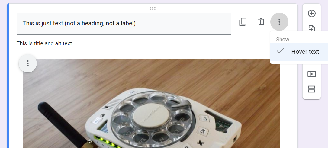
Google Forms, for example, uses “Hover Text” to set both the alt text and the title. Google Forms will not prompt you to provide text for any image, so remembering to look for the “Hover Text” option when adding an image to Google Forms is important.
Sensory Properties In Alt Text
Sensory characteristics (e.g. “bright”, “red”, “loud”, “ringing”, etc.) in writing have limited utility for people with related sensory impairment. One important accessibility requirement for writing is to avoid reliance on only sensory characteristics. Instead of describing something only by sound, color, shape, or position (on top, bottom, left, right, etc.) try to include other descriptive criteria. For example, when describing visual elements of a page the following descriptions use both sensory and non-sensory properties to reinforce accessibility:
- describe icons by function and not just color or shape, “red information icon” refers to both a sensory characteristic and the meaning of the icon
- include information related to different senses, “chair with rounded, smooth leather arms” distinguishes features that could be determined by touch for a person orienting themselves in a room depicted in an image
This is not advice to completely exclude or devalue sensory characteristics in alt text. Some people have only partial or temporary sensory impairment, so including relevant sensory characteristics in alt text can be helpful in some situations. For example: describing a person’s hair color in alt text conveys a detail about the subject in the same way the image does, so it can also help a partially sighted person identify where their head is in the image.
Sometimes thinking outside of the box with descriptive non-sensory characteristics is challenging, so if you get stumped try coming up with ideas with a colleague or friend.
Collaborating on More Inclusive Description
Writing good alt text is as much of a skill as any other writing technique, and it is a skill that benefits from practice and collaboration. Run alt text by other people. Do they agree it captures the essential meaning behind the image while being as concise as possible?
Another reason to get other people’s feedback on alt text is that it can help identify unconscious bias in descriptions. When you include the race, gender, or other aspects of social identity for some people in images through alt text, you should have a consistent and intentional strategy. For example, referring to men as “scientists” while only mentioning gender for women as “female scientists” indicates a gender bias. It is important to include this kind of information in some situations, especially in pages about specific people that include images of them.
Describing a person in alt text using accurate information that reflects how they identify is an inclusive practice that ensures everyone has access to knowledge about that person. It is also an opportunity to interrupt unconscious bias. Your practices for alt text should reflect the writing style of the surrounding content. If your team doesn’t have a strategy, some resources at the end of this document can help you get started.
Missing or Empty Alt Text
Images with no “alt” attribute are treated as an error by accessibility scanners like WAVE.
Example of what missing alt text looks like in HTML (compare to the HTML in the previous section):
<img src="https://www.lib.ncsu.edu/media/thumbnails/f5a218.jpeg"/>
In this case, a screen reader will let users know there is an image in the page, but no other information about it since there is no alt text provided. This is both frustrating and distracting, because every image without an “alt” attribute is announced repeatedly as just “Image” or some other default placeholder description.
Images with an alt attribute but the text is left empty are treated as a “feature” by WAVE. Screen readers skip these images entirely. When used properly, empty alt text reduces the amount of unimportant information exposed by a screen reader. While some accessibility scanners may treat it as a warning, this is an acceptable accessibility technique in specific situations.
Providing empty alt text for images that don’t contribute useful information avoids unnecessary “clutter” for people experiencing the alt text as a standin for the original image. Empty alt text isn’t considered an error because it can be used with careful intention to “hide” images that are intended to be decorative and don’t contribute useful information to the page.
Human judgment is required to determine if:
- an image presents distinct or supplementary information which requires alt text, or
- the image is purely decorative which does not require alt text.
Example of what empty alt text looks like in HTML:
<img src="https://www.lib.ncsu.edu/sites/default/files/swoosh.jpg" alt="" />
In many cases, a short description of the image is better than empty alt text, but when the same image is used more than a couple of times in a page the recommendation to avoid repetitive information usually outweighs the usefulness of a short description.
Editing tools for various types of electronic documents may refer to images with empty alt text as “decorative” images or “visual artifacts”. You can look for options like “mark as decorative” or “mark as artifact” to specify that an image has no important visual information.
For clarity: every image must have an “alt” attribute, but in specific cases an empty alt attribute is appropriate. When it is hard to decide if an image is informational or decorative, default to the assumption that the image is conveying information and provide alt text.
Even if an image is mostly duplicative information to the surrounding text of the page, consider carefully if there is any nuance that the image adds before deciding it should have empty alt text. It is often better to omit only repetitive information and provide some alt text to acknowledge the use of an image.
Checking Your Work
Some screen readers like WAVE may warn when there are images with short or “suspicious” alt text in the page, but for the most part they will only make sure all images have an “alt” attribute.
Running a screen reader is a good way to test-drive your alt text, but setting up that assistive technology and learning how to effectively use it can take time.
A simple and effective test for “good” alt text is to read:
- the text immediately before the image, then
- the alt text (pretend you can’t see the image), and then
- the text after.
Think about three questions:
- Is there minimal duplication of information between the alt text and surrounding text?
- Does it seem to convey the same meaning as:
- the text immediately before the image,
- viewing the image (without knowing the alt text), and
- the text after?
- Do these three texts flow together, or at least make sense?
If the answer to all three questions is “yes”, then the alt text is a good substitute for the image.
Example of alt text in context of the surrounding text as a screen reader would present it:
(screen reader indicates the following text is the main document heading)
<h1>Teaching and Visualization Lab</h1>
(screen reader indicates that it is describing an image using the provided alt text)
<img src="https://www.lib.ncsu.edu/media/thumbnails/f5a218.jpeg"
alt="Lab with full audience viewing student research on a curved screen" />
(screen reader indicates the following text is a paragraph)
<p>The Teaching and Visualization Lab is a black-box room that offers…Linked Images
One important case to consider is the use of images as a link in web pages. Careful selection of link text is important, and when an image is in a link its alt text is treated as link text. Linked images should never have empty alt text if there is no other text in the link.
While the normal recommendations for alt text apply to linked images, balancing the role of link text for helping people determine if the link will take them where they want to go also needs to be factored in. It is also important to be extra concise since link text is generally expected to be short.
Example of what a linked image looks like in HTML:
<a href="/news">
    <img src="https://www.lib.ncsu.edu/media/news.jpg" alt="News" />
</a>
Without the alt text “News” in the example above, there would be no indication to people using a screen reader why they should follow the link. The image may show the word “News”, but without the alt text people that cannot see the image won’t have access to the same information.
Libraries’ Web Style Guide Resources
NC State University Libraries Web Style Guide: Uploading Images: includes how to add alt text in Drupal
NC State University Libraries Web Style Guide: Writing For the Web
Other Resources
Other TAGs From the Libraries’ Accessibility Committee
Alternatives to Alt Text, DELTA
Image Description Guidelines, National Center for Accessible Media at WGBH
Descriptive Links, Colorado State University
WebAIM’s Guide to Alternative Text