Visualizing Co-Authorship
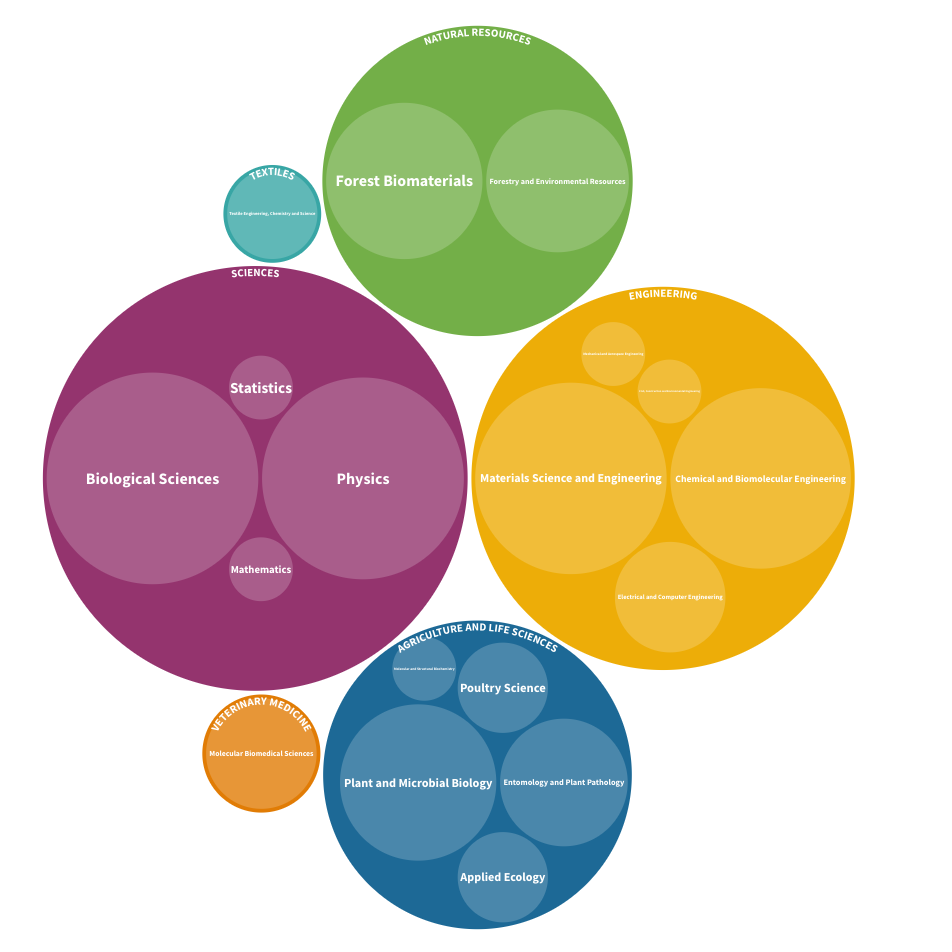
We used free software to create an interactive packed circle chart visualizing Chemistry department co-authorship with other NC State departments.

Overview
Data visualization can be used to communicate aspects of research impact such as co-authorship patterns and collaboration networks. We helped create a visualization communicating the numbers of papers co-authored by researchers in the NC State Chemistry department with researchers in other NC State departments, while organizing that information by college. A packed circle chart, also known as a circular treemap, is one way of visualizing quantity within a hierarchy.
How We Did It
The data used to create this visualization was obtained from Academic Analytics.
The are several free tools that can be used to visualize research impact. In this case we used Flourish to create an interactive packed circle chart showing NC State Chemistry department co-authorship with other NC State departments. Flourish is free if you are willing to create an account and make your data and visualization publicly accessible.
If you are interested in visualizing research impact, contact us for more information or to schedule a consultation.
Results
Team
 Gavin WilliamsAssociate Head, Department of Chemistry
