Readability Widget + Tiny Café
Participants gave us feedback on a pilot project—the Readability Widget. Overall, they had positive feedback. They especially liked the “Warm Background” option.
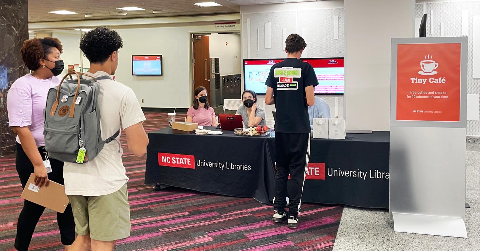
Overview
We held a two-hour Tiny Café at the Hill Library to gather feedback about a pilot project—the Readability widget. This project aims to expand the accessibility and readability of the Libraries website by providing viewing options that may increase readability for some (but not all) users.
Our goals were to answer these questions:
- How useful is the widget for people who would use the features?
- How unobtrusive is the widget for people who don’t want the features?
- Does it works on a variety of devices and screen sizes?
Eighteen participants tested its features, which gave website pages a warm background, hid all images on the page, highlighted links, or implemented a dyslexia-friendly font. Most tested the widget on the provided Mac laptop, and some used their own smartphones. Overall, feedback was positive.


About half of the participants noticed the widget button on the page they were asked to look at before moderators directed their attention to it.
For the way the widget looked, participants rated it an average of 4.5 out of 5.
For usefulness, participants rated the widget an average of 3.3 out of 5.
When asked which features they personally would use, 11 out of the 18 participants said they would turn on the Warm Background feature. Five said they would use Highlight Links, two said Hide Images, and just one said OpenDyslexic Font.
Several participants commented that the Warm Background feature is similar to options offered by operating systems, like Night Shift on Mac OS. One participant said they used it on their laptop.
A few participants were confused by the Hide Images option and weren’t sure about its use case (we included it for users who find images distracting, especially on text-heavy pages.)
Although just one participant said they’d find the OpenDyslexic Font option useful themselves, several participants said it was “cool” that it was included and imagined it would be useful for other people.
Recommendations before launching this widget
- "Hide images" should be the fourth feature in the list, switching places with "Highlight Links," so that the order of the options better represents how understandable and useful participants found them.
- Test across multiple mobile operating systems and browsers to ensure that the widget tab does not overlap with home buttons or other phone features.
How We Did It
We used the Tiny Café model for this user research. We set up a table with coffee and pastries in a busy area of the Hill Library. We had 18 participants ranging from first-year undergraduate to a staff member.


