Annonatate Usability Study
Students provided feedback on Annonatate, a web app for annotating images. Their feedback focused on the appearance of the application and confusion regarding navigation and sharing their work.
Overview
Between Feb. 28 and Mar. 2, 2023, we held a usability study with six participants on Annonatate, a web app for annotating images that is created and maintained by Niqui O’Neill. All participants were able to use the app to upload, annotate images, and understand the purpose and scope of the app. After the study, Niqui implemented many interface improvements based on the findings of the study.
Findings
How usable is the annotation-creating interface?
What we found:
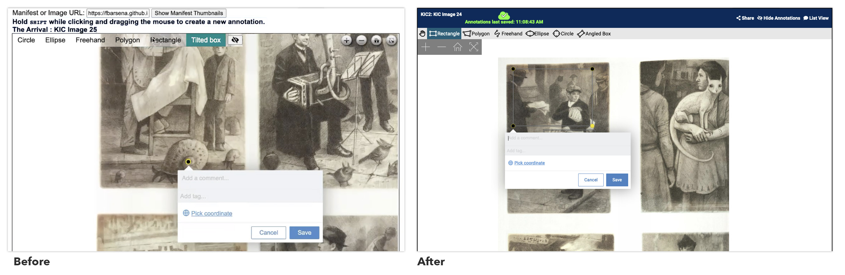
- Users sometimes forgot to shift while clicking/dragging to create annotations, not noticing the instructions in text above the work area.
- Users had trouble using the polygon shape selector and tilted box shape. Some misread "tilted box" as "titled box."
What we recommended & implemented:
- Consider using the alternative click/pan modality in the work area, which makes it clearer whether the user is in panning mode or drawing mode.
- Include small visual icons (similar to Photoshop) to indicate what a user can expect.
How easy is it to log into the application?
What we found:
- Users had no issues. The large “Log in with Github” button was clear and usable.
Do users understand how to access and view their annotations?
What we found:
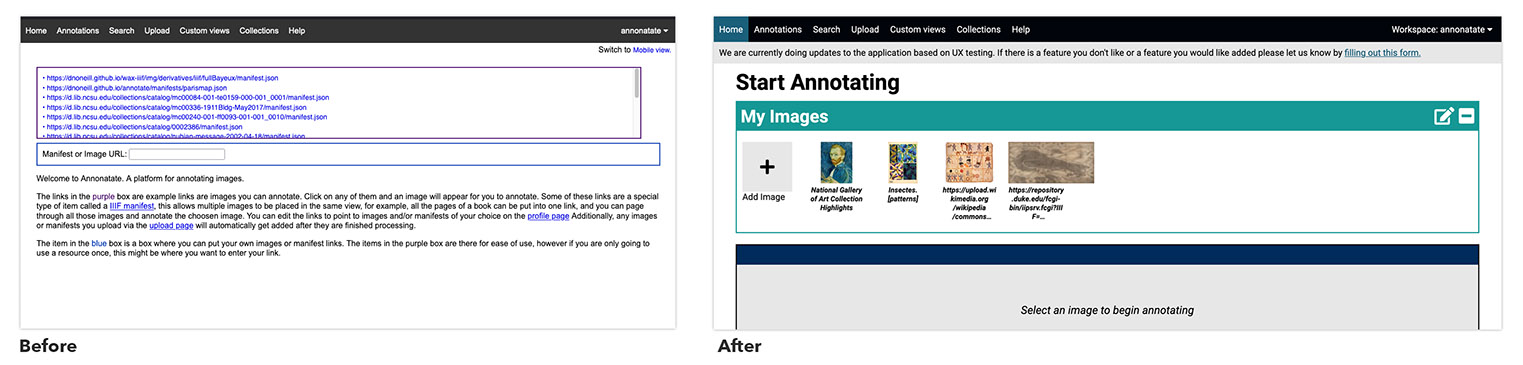
- Users were confused about the work area’s location, going to the “Annotations” tab instead of the Home page.
- It was difficult for users to find a previously uploaded image and any annotations on it, as evidenced by their clicking through other pages first.
What we recommended & implemented:
- The homepage should have a primary heading that is a call to action.
- Display thumbnails, not raw URLs, representing previously uploaded images on the home page.
- Add a gray placeholder block to indicate where the work area would be.
What are users’ high-anxiety points?
What we found:
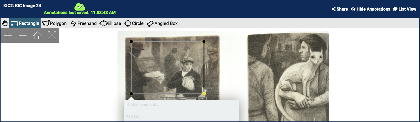
- Users questioned whether their work was saved and "hoped for the best" when they navigated away from the work area.
What we recommended & implemented:
- Add a constant visual indicator of whether and when their work was saved. This uses an icon (a checkmark in a cloud shape) and the words "Annotations last saved: [time]."
How quickly can users figure out how to use the application?
What we found:
- Most participants figured out the application fairly quickly, even though we didn’t provide much information about what the app is or how to use it.
How We Did It
Usability sessions were 45 minutes long and took place over Zoom. Participants consisted of undergraduate and graduate students.
Summary written by Myra Bari, student assistant to the Web Team
Team
 Robin DavisAssociate Head, User Experience
 Victor BettsFormer Student Success Librarian for Special Collections
 Niqui O'NeillFormer Digital Technologies Development Librarian