Creating sensory friendly maps
We designed floor maps for users with sensory sensitivities who are looking for study spaces that fit their needs. These maps highlight spaces in the Hill and Hunt Libraries that have natural or warm lighting, tend to be quiet, or tend to be uncrowded.
Overview
This project resulted in a new set of maps for the Hill and Hunt Libraries: sensory friendly maps. For each of our main libraries, these six PDF maps highlight spaces that:
- tend to be quiet or have sound-masking controls
- tend to be uncrowded
- have natural, warm, or adjustable lighting
We designed these maps for users with sensory sensitivities, like some autistic users, but they may be useful for everybody!
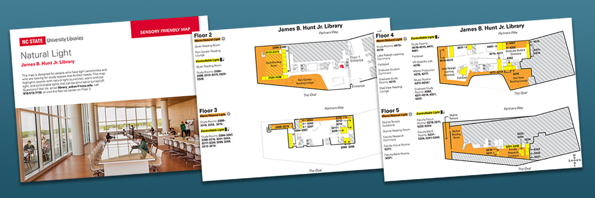
Here's an example of one of our sensory friendly maps:

Sensory map - Hunt Library - Natural and warm lighting
PDF (1799.9KB)
Our next steps for this project:
- Provide these maps in printed form
- Make these spaces searchable by facet on our website
- Update, March 2022: These spaces are now searchable in Explore Spaces! Find rooms and areas of the Libraries by lighting type and sound level, as well as by other filters like furniture type. (View screenshot.)
How We Did It
Space walk-through

Marked-up map by Katharine Frazier
In summer 2021, we printed out our existing floor maps of both libraries and organized a group walk-through of each. We marked up our maps with notes about lighting type, crowdedness, and noise levels.
Design and layout

Detail from the map of natural, warm, and controllable lighting for the Hunt Library, Floor 2
We used the base map design that is featured on our touchscreen kiosks. Beck Buss, a graphic design student here at NC State, came up with a visual language to indicate the characteristics of each space that we'd marked on our printed maps. He ensured that the color choices would be usable for users with different types of colorblindness and when printed out in black and white.
We collaborated with External Relations to use up-to-date maps and ensure that the design met Libraries and University branding standards.
Feedback from staff
We sent the map drafts to colleagues who could advise us on the spaces that were highlighted on the maps as well as design elements. Beck incorporated their feedback into the maps.
Final walk-through
Since our initial walk-through had occurred during the summer when there were fewer students on campus, we conducted another walk-through of both libraries to confirm the accuracy of the spaces we chose to highlight as uncrowded, quiet, or featuring warm or natural lighting.
Results
Recognition
Team
 Josh BoyerDepartment Head, User Experience
 Sarah HawksUniversity Library Specialist
 Robin DavisAssociate Head, User Experience
 Katharine FrazierFormer NCSU Libraries Fellow
 Charles SamuelsCreative Director
 Rob RuckerChief Strategist for Student Success
 Beck BussGraphic design student