Catalog search context + Tiny Café
We conducted usability tests on two proposed designs for context-switching in the catalog. Tests showed that between the designs tested, a radio button design was clear and usable.
Overview
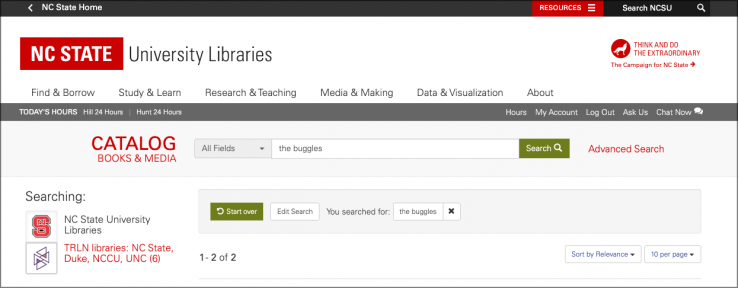
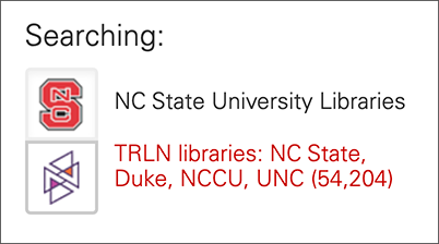
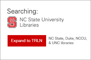
The NC State University Libraries' catalog underwent a major redesign in spring 2019. While the new look was a success overall, the “toggle” design of the NC State and TRLN button links was a known problem. Librarians themselves shared anecdotes of forgetting whether they were viewing NC State-only results or TRLN-wide results, as the design of the logos with link text did not make it clear. We surmised that this was partially due to the red color of the link, which made the unselected context look highlighted, in addition to the unclear meaning of the logo outline shading.
The feature in question controls whether search results were from NC State only or from all Triangle Research Library Network campuses. We refer to the NC State-only and TRLN-wide views of search results as “search contexts.”
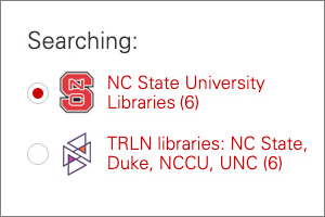
The Catalog Transition Team and some of the User Experience department staff came up with two alternative designs: radio buttons and an expand/limit button.
Research questions
Which design is visually clearest? Which design can help users understand at a glance which search context they’re in?
What we found
All 23 participants reported that they found the radio button design to be clearer and more helpful than the expand/limit button design. With the radio button design, they were able to immediately identify which search context the page was in and what the buttons did.
Part of the usability test included a hands-on task to find a book on Greek mythology that they could access today (with the implication that it had to be available in the library building that we were in), with the added obstacle that the search page that we presented displayed TRLN-wide search results. Half of the participants were presented with a catalog interface that had the radio button design, and the other half were presented with an interface with the expand/limit buttons. Slightly more users who were given the radio button design used the buttons to switch contexts than those who were given the expand/limit button design. Regardless of interface provided, all students were able to find a relevant book, with many participants relying on other features of the page to narrow down to a book on the NC State campus.
The second — and more telling — part of the test was a paper-based comparison between the two designs. These were printed out as screenshots. When evaluating the radio button, users were asked to identify the current search context, and all users correctly identified it with no hesitation. By contrast, when asked which search context was selected in the expand/limit button design, 13 participants hesitated before identifying the correct choice, five chose correctly with no hesitation, and three remarked that nothing looked “selected.”
Participant comments were particularly helpful, including these:
- Several remarked that the radio button design made the choice clear between the two views, since they had equal visual weight.
- One mentioned that the radio button design was familiar and thus they would know what to do. (In UX, we call this a design pattern.)
- Some noted that they didn’t know what “TRLN” was, though most were able to deduce this based on the TRLN-view results that included UNC, Duke, etc. A few guessed in passing that it stood for “Triangle Research Libraries… something.”
Conclusions and recommendations
Based on the results of this usability test, we recommended the implementation of the radio buttons in the user interface instead of the present toggle design. Additionally, we recommended that the text of both links should be red, rather than just the unselected option.
This report was well received, and the catalog team implemented the radio button design in the catalog’s user interface.
How We Did It
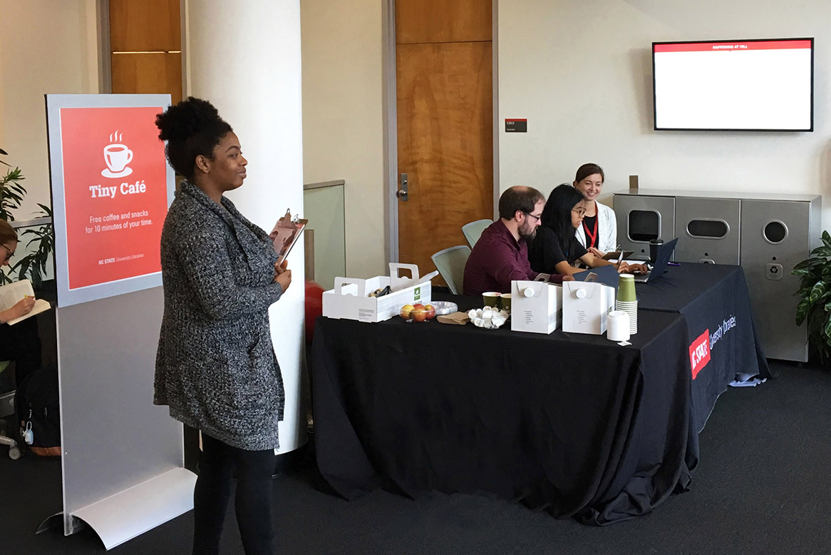
We held a Tiny Café in the lobbies of the D. H. Hill Jr. Library and the James B. Hunt Jr. Library in September 2019. Coffee, apples, and baked goods were offered as compensation for 10 minutes of participants’ time. Jaliyah Scott, a graduate student and Libraries employee, aided in managing people interested in participating.
Two laptops were used, each running a local version of the catalog application. One had the radio button design, and the other had the expand/limit button design. In this A/B test, half of the participants used one laptop, and half the other.
We asked participants to find two books by topic. For the first book, they began the task at the catalog homepage. For the second book, they began the task at a page displaying unrelated search results (simulating how the catalog might look if they walked up to a publicly available lookup kiosk). We took notes on which user interface features they used, whether they were successful, and any relevant comments the participant made. Then we asked participants to compare printed-out screenshots of each design and talk us through their response to the visuals.
About the 23 participants:
- 19 had used the library catalog before
- 9 had had a librarian/library visit in one of their classes
- 11 of the students were in their first semester at NC State
- 13 were undergraduate students
- 9 were graduate students
- 1 was a staff member (in a department outside of the Libraries)
Team
 Robin DavisAssociate Head, User Experience
 Andreas OrphanidesLead Librarian for UX Strategy
 Cole HudsonFormer Discovery Systems Manager
 Jaliyah ScottLibraries Student Worker